QC Rebrand
Branding & Visual Identity Design for Queens College, blending bold geometry with historical and modern elements to captivate a younger audience.
Role:
Designer, Branding Specialist, and Creative Director
About the Project:
QC Rebrand is a bold and geometric refresh of Queens College’s identity, designed to appeal to a younger demographic while maintaining a connection to the school’s heritage. The designs draw inspiration from QC’s architecture, including the iconic clock tower, and feature a geometric representation of the school mascot, the knight.
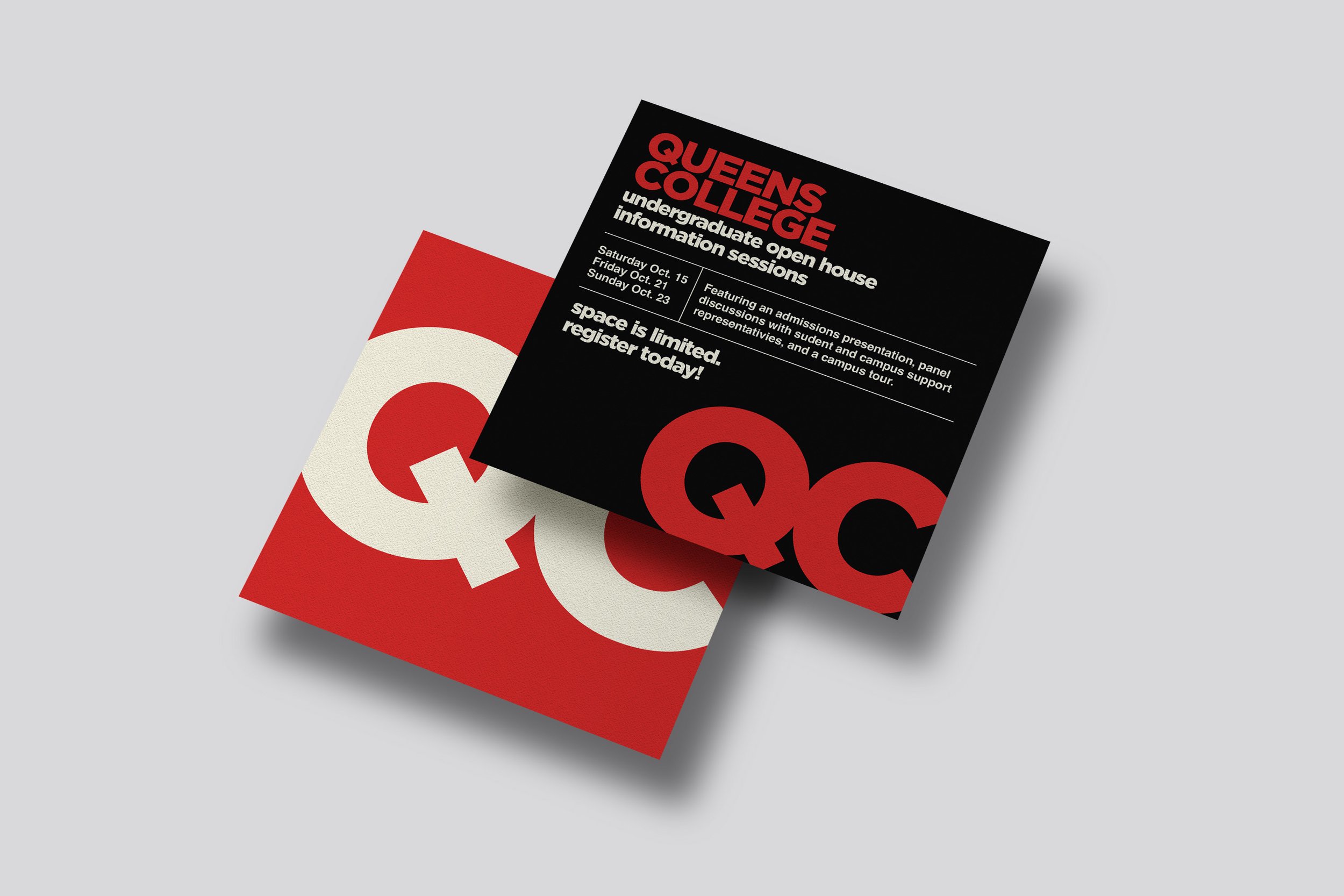
The rebrand balances simplicity and boldness to grab attention quickly without overwhelming the viewer. By keeping the original QC color scheme, the designs retain familiarity while introducing a modern twist. The vibrant palette and geometric elements ensure the branding feels both contemporary and aligned with QC’s identity.
The new branding reflects thorough research into QC’s existing branding and merchandise, resulting in a cohesive, versatile style that stands out across various mediums, from print to social media and merchandise.
Deliverables:
Logo Design
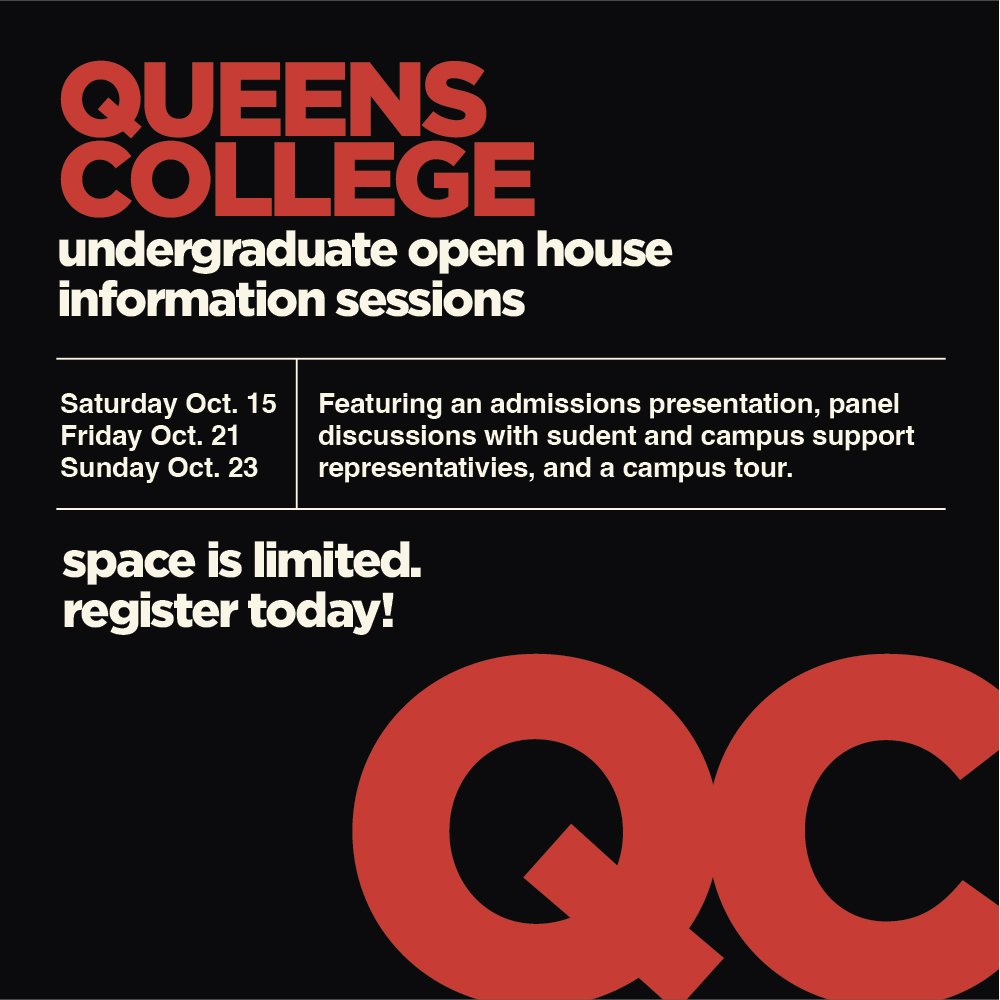
Print Advertisement Mockups
Swag & Merchandise Mockups (including sweatshirts and other items)
Two Custom Patterns with Original Illustrations
Social Media Branding
Highlights:
Logo Design: A striking new logo that modernizes QC’s identity while honoring its traditional elements.
Color Palette: Bold, vibrant colors aligned with QC’s original branding, creating continuity while adding energy.
Patterns & Illustrations: Custom geometric patterns incorporating illustrations that highlight QC’s architectural and mascot features, usable across platforms and merchandise.
Merchandise Mockups: Created designs for swag, including sweatshirts and branded items, to connect with the younger audience.
Credits:
All work, from research to final designs, completed independently.


